13 KiB
title, sidebar_position
| title | sidebar_position |
|---|---|
| 物料描述详解 | 2 |
物料描述概述
中后台前端体系中,存在大量的组件,程序员可以通过阅读文档,知悉组件的用法。可是搭建平台无法理解 README,而且很多时候,README 里并没有属性列表。这时,我们需要一份额外的描述,来告诉低代码搭建平台,组件接受哪些属性,又是该用怎样的方式来配置这些属性,于是,《中后台低代码组件描述协议》应运而生。协议主要包含三部分:基础信息、属性信息 props、能力配置/体验增强 configure。
物料配置,就是产出一份符合《中后台低代码组件描述协议》的 JSON Schema。如果需要补充属性描述信息,或需要定制体验增强部分(如修改 Setter、调整展示顺序等),就可以通过修改这份 Schema 来实现。目前有自动生成、手工配置这两种方式生成物料描述配置。
可视化生成物料描述
使用 Parts 造物平台:使用文档
自动生成物料描述
可以使用官方提供的 @alilc/lowcode-material-parser 解析本地组件,自动生成物料描述。把物料描述放到资产包定义中,就能让低代码引擎理解如何制作物料。详见上一个章节“物料扩展”。
下面以某个组件代码片段为例:
// /path/to/component
import { PureComponent } from 'react';
import PropTypes from 'prop-types';

export default class FusionForm extends PureComponent {
  static displayName = 'FusionForm';

  static defaultProps = {
    name: '张三',
    age: 18,
    friends: ['李四','王五','赵六'],
  }

  static propTypes = {
    /**
     * 这是用于描述姓名
     */
    name: PropTypes.string.isRequired,
    /**
     * 这是用于描述年龄
     */
    age: PropTypes.number,
    /**
     * 这是用于描述好友列表
     */
    friends: PropTypes.array
  };

  render() {
    return <div>dumb</div>;
  }
}
引入 parse 工具自动解析
import parse from '@alilc/lowcode-material-parser';
(async () => {
  const result = await parse({ entry: '/path/to/component' });
  console.log(JSON.stringify(result, null, 2));
})();
因为一个组件可能输出多个子组件,所以解析结果是个数组。
[
  {
    "componentName": "FusionForm",
    "title": "",
    "docUrl": "",
    "screenshot": "",
    "devMode": "proCode",
    "npm": {
      "package": "",
      "version": "",
      "exportName": "default",
      "main": "",
      "destructuring": false,
      "subName": ""
    },
    "props": [
      {
        "name": "name",
        "propType": "string",
        "description": "这是用于描述姓名",
        "defaultValue": "张三"
      },
      {
        "name": "age",
        "propType": "number",
        "description": "这是用于描述年龄",
        "defaultValue": 18
      },
      {
        "name": "friends",
        "propType": "array",
        "description": "这是用于描述好友列表",
        "defaultValue": [
          "李四",
          "王五",
          "赵六"
        ]
      }
    ]
  }
]
手工配置物料描述
如果自动生成的物料无法满足需求,我们就需要手动配置物料描述。本节将分场景描述物料配置的内容。
常见配置
组件的属性只有有限的值
增加一个 size 属性,只能从 'large'、'normal'、'small' 这个候选值中选择。
以上面自动解析的物料为例,在此基础上手工加上 size 属性:
[
  {
    "componentName": "FusionForm",
    "title": "",
    "docUrl": "",
    "screenshot": "",
    "devMode": "proCode",
    "npm": {
      "package": "",
      "version": "",
      "exportName": "default",
      "main": "",
      "destructuring": false,
      "subName": ""
    },
    "props": [
      {
        "name": "name",
        "propType": "string",
        "description": "这是用于描述姓名",
        "defaultValue": "张三"
      },
      {
        "name": "age",
        "propType": "number",
        "description": "这是用于描述年龄",
        "defaultValue": 18
      },
      {
        "name": "friends",
        "propType": "array",
        "description": "这是用于描述好友列表",
        "defaultValue": [
          "李四",
          "王五",
          "赵六"
        ]
      }
    ],
    // 手工增加的 size 属性
    "configure": {
      "isExtend": true,
      "props": [
        {
          "title": "尺寸",
          "name": "size",
          "setter": {
            "componentName": 'RadioGroupSetter',
            "isRequired": true,
            "props": {
              "options": [
                { "title": "大", "value": "large" },
                { "title": "中", "value": "normal" },
                { "title": "小", "value": "small" }
              ]
            },
          }
        }
      ]
    }
  }
]
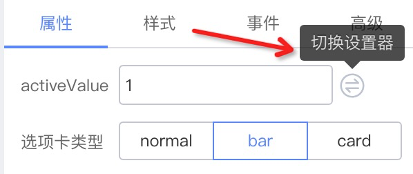
组件的属性既可以设置固定值,也可以绑定到变量
我们知道一种属性形式就需要一种 setter 来设置,如果想要将 value 属性允许输入字符串,那就需要设置为 StringSetter,如果允许绑定变量,就需要设置为 VariableSetter,具体设置器请参考预置设置器列表。
那如果都想要呢?可以使用 MixedSetter 来实现。
{
  // ...
  configure: {
    isExtend: true,
    props: [
      {
        title: '输入框的值',
        name: 'activeValue',
        setter: {
          componentName: 'MixedSetter',
          isRequired: true,
          props: {
            setters: [
              'StringSetter',
              'NumberSetter',
              'VariableSetter',
            ],
          },
        }
      }
    ]
  }
}
设置后,就会出现“切换设置器”的操作项了

开启组件样式设置
{
  configure: {
    // ...,
    supports: {
      style: true,
    },
    // ...
  }
}
设置组件的默认事件
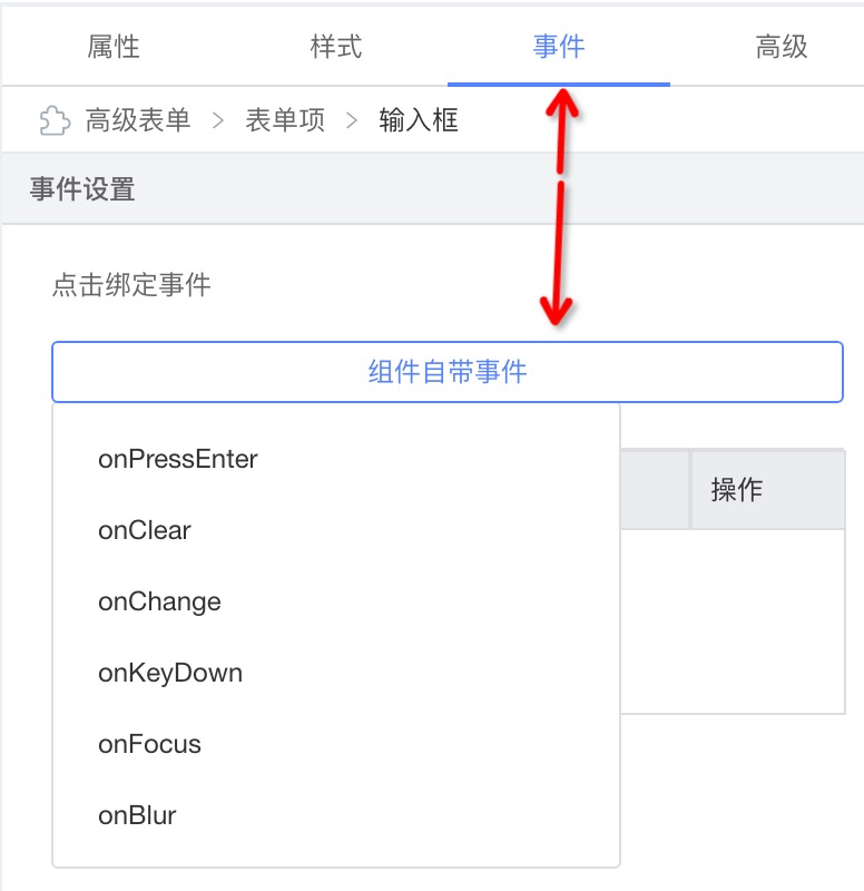
{
  configure: {
    // ...
    supports: {
      events: ['onPressEnter', 'onClear', 'onChange', 'onKeyDown', 'onFocus', 'onBlur'],
    },
    // ...
  }
}
设置 prop 标题的 tip
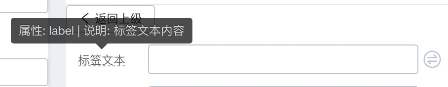
{
  name: 'label',
  setter: 'StringSetter',
  title: {
    label: {
      type: 'i18n',
      zh_CN: '标签文本',
      en_US: 'Label',
    },
    tip: {
      type: 'i18n',
      zh_CN: '属性:label | 说明:标签文本内容',
      en_US: 'prop: label | description: label content',
    },
  },
}
配置 prop 对应 setter 在配置面板的展示方式
inline

{
  configure: {
    props: [{
      description: '标签文本',
      display: 'inline',
    }]
  }
}
block

{
  configure: {
    props: [{
      description: '高级',
      display: 'block',
    }]
  }
}
accordion

{
  configure: {
    props: [{
      description: '表单项配置',
      display: 'accordion',
    }]
  }
}
entry

{
  configure: {
    props: [{
      description: '风格与样式',
      display: 'entry',
    }]
  }
}
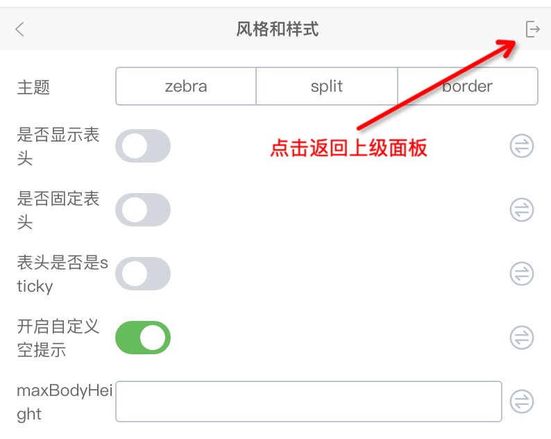
plain
{
  configure: {
    props: [{
      description: '返回上级',
      display: 'plain',
    }]
  }
}
进阶配置
组件的 children 属性允许传入 ReactNode
例如有一个如下的 Tab 选项卡组件,每个 TabPane 的 children 都是一个组件

只需要增加 isContainer 配置即可
{
  // ...
  configure: {
    // ...
    component: {
      // 新增,设置组件为容器组件,可拖入组件
      isContainer: true,
    },
  }
}
假设我们希望只允许拖拽 Table、Button 等内容放在 TabPane 里。配置白名单 childWhitelist 即可
{
  // ...
  configure: {
    // ...
    component: {
      isContainer: true,
      nestingRule: {
        // 允许拖入的组件白名单
        childWhitelist: ['Table', 'Button'],
        // 同理也可以设置该组件允许被拖入哪些父组件里
        parentWhitelist: ['Tab'],
      },
    },
  },
}
组件的非 children 属性允许传入 ReactNode
这就需要使用 SlotSetter 开启插槽了,如下面示例,给 Tab 的 title 开启插槽,允许拖拽组件

{
  // ...
  configure: {
    isExtend: true,
    props: [
      {
        title: '选项卡标题',
        name: 'title',
        setter: {
          componentName: 'MixedSetter',
          props: {
            setters: [
              'StringSetter',
              'SlotSetter',
              'VariableSetter',
            ],
          },
        },
      },
    ],
  },
}
屏蔽组件在设计器中的操作按钮
正常情况下,组件允许复制:

如果希望禁止组件的复制行为,我们可以这样做:
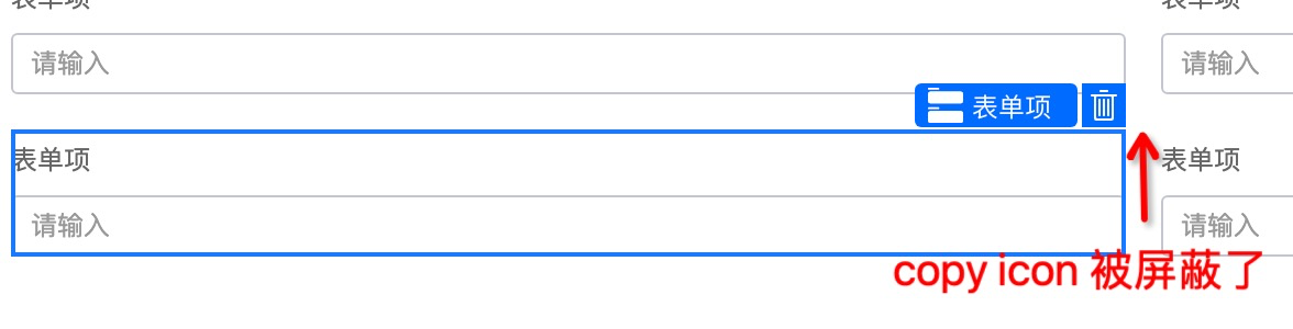
{
  configure: {
    component: {
      disableBehaviors: ['copy'],
    },
  },
}
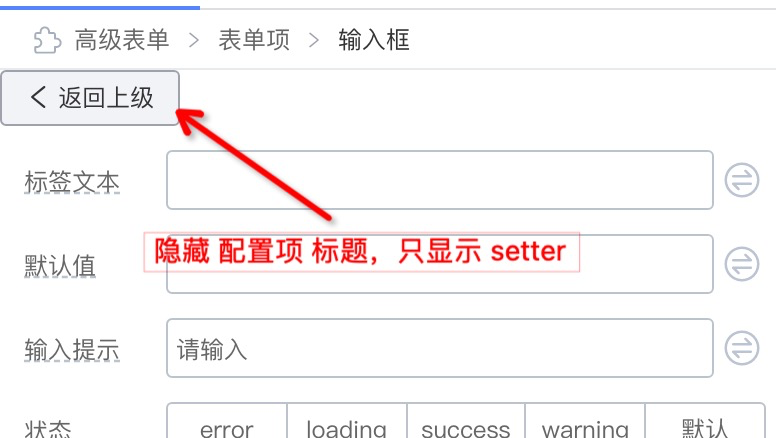
实现一个 BackwardSetter

{
  name: 'back',
  title: ' ',
  virtual: () => true,
  display: 'plain',
  setter: BackwardSetter,
}

// BackwardSetter
import { SettingTarget, DynamicSetter } from '@alilc/lowcode-types';
const BackwardSetter: DynamicSetter = (target: SettingTarget) => {
  return {
    componentName: (
      <Button
        onClick={() => {
          target.getNode().parent.select();
        }}
      >
        <Icon type="arrow-left" /> 返回上级
      </Button>
    ),
  };
};
高级配置
不展现一个 prop 配置
- 始终隐藏当前 prop
{
  // 始终隐藏当前 prop 配置
  condition: () => false,
}
- 根据其它 prop 的值展示/隐藏当前 prop
{
  // direction 为 hoz 则展示当前 prop 配置
  condition: (target) => {
    return target.getProps().getPropValue('direction') === 'hoz';
  }
}
props 联动
// 根据当前 prop 的值动态设置其它 prop 的值
{
  name: 'labelAlign',
  // ...
  extraProps: {
    setValue: (target, value) => {
      if (value === 'inset') {
        target.getProps().setPropValue('labelCol', null);
        target.getProps().setPropValue('wrapperCol', null);
      } else if (value === 'left') {
         target.getProps().setPropValue('labelCol', { fixedSpan: 4 });
         target.getProps().setPropValue('wrapperCol', null);
      }
      return target.getProps().setPropValue('labelAlign', value);
    },
  },
}
// 根据其它 prop 的值来设置当前 prop 的值
{
  name: 'status',
  // ...
  extraProps: {
    getValue: (target) => {
      const isPreview = target.getProps().getPropValue('isPreview');
      return isPreview ? 'readonly' : 'editable';
    }
  }
}
动态 setter 配置
可以通过 DynamicSetter 传入的 target 获取一些引擎暴露的数据,例如当前有哪些组件被加载到引擎中,将这个数据作为 SelectSetter 的选项,让用户选择:
{
  setter: (target) => {
    return {
      componentName: 'SelectSetter',
      props: {
        options: target.designer.props.componentMetadatas.filter(
          (item) => item.isFormItemComponent).map(
            (item) => {
              return {
                title: item.title || item.componentName,
                value: item.componentName,
              };
            }
          ),
        ),
      },
    };
  }
}